Publi Fluor
Publi Fluor is a digital reinterpretation of a set of adhesive letters.
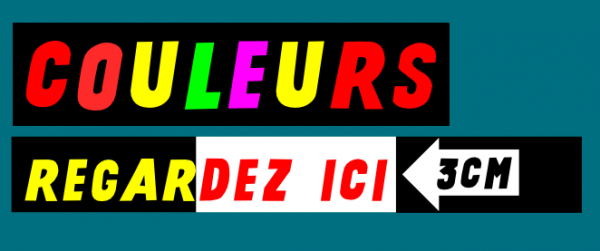
The Publi Fluor shop was situated in the northern part of Brussels, Schaerbeek, and founded by the father of Madame Christelle Crickx who was a trained letter painter. In his day he is—it seems—the first to propose fluorescent colors for shopwindow signs. It proves so difficult to paint letters on site with that kind of unstable coating that he develops a technique based on vinyl that he fluo-colors and cuts by hand in the workplace, then sticks at clients shops. Around 1975, his health degrades quickly and his daughter is forced to step into the business.

Starting to cut letters with the rounded and skilled cardboard templates drawn by her father, Madame Crickx slowly morphs the shapes by analysing how typographic niceties confuse her non-trained clients and leads to bad letters placement. She progressively removes the optical compensation of rounded tops and bottoms, straightens sides, and attaches accents for less floating parts. Those moves add a very specific orientation to this otherwise quite common bold italic sans serif display typeface.
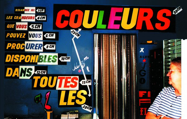
During about fifty years these craft lettres have spread across the windows of shopping streets, more and more, and after the closure of the shop in the early noughties, they seem to still hold their own to the assaults of vector vinyl cutting technology.

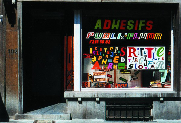
In 1996, Pierre Huyghebaert and Vincent Fortemps have just started to work for the cultural center les Halles de Schaerbeek. For a series of events linked to India, an interest to mix local and distant vernacular takes shape. Those letters spotted on Schaerbeek’s shopwindows years before seem to fit the job ideally. After a few wanderings in the streets nearby, the small lettershop at the bottom of the dull Avenue Rogier, shining with its fluo shapes, is finally spotted as the origin of these typographic waves… And the inside of the shop proves to be even more amazing.
First contacts with Madame Crickx follow, the first poster is typeset letter by letter, then Pierre Huyghebaert pays other visits and it becomes obvious that these letters deserve more than a one-time usage, as Madame Crickx’s work deserves more than simply buying some letters more. For the following Halles assignments, after a quick-and-dirty Fontographer vectorisation, the Crickx font is heavily used. This font is called the Crickx Rush in reference of the time constrains that characterize this kind of operation. When Jan Middendorp, then Editor of the Belgian fontshop magazine Druk, orders an article on the letters, it is the occasion for Pierre to try to investigate and understand better the process described herebefore. (Astonishingly, shortly before the magazine stops, a poll seems to have elected the article as one of the most favoured by the readers…).

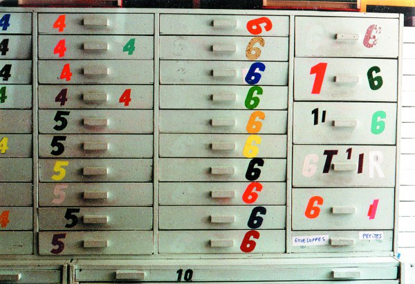
When Madame Crickx follows the retirement of her postman husband, the studio Speculoos (where Pierre works) buys the whole stock of letters and dingbats and vinyle for a symbolic prize, stores it in their basement of Saint-Gilles but uses it for some of their funkiest windowshop displays. He ask Madame Crickx to cut lower-cases for her letters as with other accented and diacritics to cover more or less the Latin-1 codepage, by trying to give her just enough sample to distinguish the characters but not much to influence the way to draw them. As answers, she cut a completely new and fantasy set of letters (called the blobby in the pack)… After a discussion, she propose new lower-case, more in sync with the upper cases classical ones, but not sharing exactly the same low contrast. After years of sleeping on hard-drive and archives, in 2010, Ludi Loiseau and Antoine Begon uplift the work to redraw the outlines to produce a more complete and less trashy version (Regular), explore the non-italic more rare one (Droite Rush and Droite) and extend it with lower cases (SharkCut). Finally, the Crickx’s cabinet regains a better place at the new Constant Variable place, Rue Gallait 80, less than a kilometer far from the original shop place…
In 2017, on Sophie's initiative, the archive is relocated in Spec uloos' (renamed with spacing inserted between the two parts of the name) new office space, 47 Rue Van Elewyck, Ixelles.
2020 "Un Futur pour la Culture," a call for projects, is launched by the Wallonia-Brussels Federation (a.k.a the Brussels French Community). Surface Utiles editions grab this opportunity to fund a project that could lead to a publication on the Publi Fluor archive.
The research will be carried out over four years.
In April 2024, Publi Fluor was launched. This non-standard collective essay attempts to tell the life of a type model, its successive authors and their tools, all while broadening the field and exploring the interstices between the many stories that Chrystel Crickx’s practice gave rise to. At the same time, the digital font is republished under the name Publi Fluor.
More :
Visit the research associated with the history of these letters, via the extracts published on the website and by leafing through the specimen publication.
This non-standard collective essay attempts to tell the life of a type model, its successive authors and their tools, all while broadening the field and exploring the interstices between the many stories that Chrystel Crickx’s practice gave rise to.
PDF of an article of 1999 in Dutch (translated by Jan Middendorp and French (original).
Small article in Médor magazine
We are very happy to receive news from what you do or works you spot that use these fonts!
On est très heureux de recevoir des infos à propos de travaux que vous réalisez ou que vous remarquez qui utilisent ces fontes!
Version française : Publi Fluor est une réinterprétation numérique d'un ensemble de lettres adhésives.
La boutique Publi Fluor était située dans la partie nord de Bruxelles, Schaerbeek, et fondée par le père de Madame Christelle Crickx, peintre en lettres. De son temps, il est, semble-t-il, le premier à proposer des couleurs fluorescentes pour les enseignes de vitrines. Il s'avère si difficile de lettre sur site avec ce type de revêtement instable qu'il développe une technique basée sur le vinyle qu'il colore et découpe à la main sur le lieu de travail, puis colle dans les magasins des clients. Vers 1975, sa santé se dégrade rapidement et sa fille est obligée de reprendre l'entreprise au pied levé.
Commençant à découper les lettres avec les gabarits en carton des lettrages arrondis et habiles dessinés par son père, Madame Crickx transforme lentement ces formes en analysant comment les subtilités typographiques désorientent ses clients non formés et et les amènent vers un mauvais placement des lettres. Elle supprime progressivement les compensations optiques des pointes et des fonds arrondis, redresse les côtés et attache des accents pour proposer moins de parties flottantes. Ces glissements donnent une orientation très spécifique à cette police de caractères italiques gras sans empattement.
Pendant une cinquantaine d'années, ces lettres artisanales se répendent à travers les vitrines des rues commerçantes. Et après la fermeture de la boutique à la fin des années 90, elles semblent toujours résister aux assauts de la technologie vectorielle de découpe de vinyle.
En 1996, Pierre Huyghebaert et Vincent Fortemps viennent de commencer à travailler pour le centre culturel les Halles de Schaerbeek. Pour une série d'événements liés à l'Inde, l'intérêt de mélanger le local et le vernaculaire lointain prend forme. Ces lettres repérées sur les vitrines de Schaerbeek des années auparavant semblent correspondre idéalement. Après une série de maraudes en rond dans l'eau dans les rues avoisinantes, le petit magasin de lettres au bas de l'avenue Rogier, vibrant de ses couleurs fluo, est enfin repéré comme origine de ces ondes typographiques.... Et l'intérieur de la boutique s'avère encore plus étonnant.
Les premiers contacts avec Madame Crickx suivent, la première affiche est composée lettre par lettre, puis Pierre Huyghebaert fait d'autres visites et il devient évident que ces lettres méritent plus qu'un usage unique, et que le travail de Madame Crickx mérite plus qu'un simple achat de lettres. Pour les commandes suivantes, après une vectorisation rapide et sale en Fontographer, la police Crickx est fortement utilisée. Elle est appelée Crickx Rush en référence aux contraintes de temps qui caractérisent ce type d'opération. Lorsque Jan Middendorp, alors rédacteur en chef du magazine belge Druk, commande un article à propos de ce lettrage atypique, c'est l'occasion pour Pierre d'essayer d'enquêter et de mieux comprendre le processus décrit précédemment. (Étonnamment, peu avant l'arrêt du magazine, un sondage semble avoir élu l'article comme l'un des plus appréciés des lecteurs...).
Lorsque Madame Crickx suit le départ à la retraite de son mari facteur, l'atelier Speculoos (où travaille Pierre) achète tout le stock de lettres et de dingbats et de vinyle pour un prix symbolique et surtout en éviter la destruction, le stocke dans leur sous-sol de Saint-Gilles mais l'utilise pour certaines de leurs vitrines les plus funky. Il demande à Madame Crickx de couper les minuscules pour ses lettres comme pour les autres accents et diacritiques pour couvrir plus ou moins le codepage latin-1, en essayant de lui donner juste assez d'échantillons visuels que pour distinguer les caractères mais pas trop pour éviter d'influencer la façon de les dessiner. En guise de réponse, elle découpe un jeu de lettres complètement nouveau et fantastique (appelé le Blobby dans le pack).... Après une discussion, elle propose de nouvelles minuscules, plus synchronisées avec les majuscules classiques, mais ne partageant pas exactement le même faible contraste. Après des années de sommeil sur disque dur et archives vinyle, en 2010, Ludi Loiseau et Antoine Begon d'Open source Publishing s'attaque au travail de redessiner les contours pour produire une version plus complète et moins trash (Regular), explorer la version non italique plus rare (Droite Rush et Droite) et l'étendre avec des minuscules (SharkCut). Enfin, l'armoire du Crickx retrouve une meilleure place dans l'immeuble Variable où OSP a son studio, Rue Gallait 80, à moins d'un kilomètre du magasin d'origine... Puis elle suit le déménagement de la caravane vers le 25e étage de la tour WTC, là encore en restant proche de son point d'origine.
En 2017, à l’initiative de Sophie, rapatriement de l’archive vers les nouveaux locaux de Spec uloos (renommé avec insertion d’une espace entre les deux parties du nom), rue Van Elewyck 47 à Ixelles.
2020, un Futur pour la Culture, appel à projet lancé par la Fédération Wallonie-Bruxelles (autre nom de la Communauté française). Les éditions Surfaces Utiles y voient l’opportunité de financer la recherche qui pourrait alimenter la publication d’un livre autour de l’archive Publi Fluor.
La recherche s'étendra sur quatre années.
En avril 2024, l’ouvrage Publi Fluor est lancé. Cet essai collectif non standard tente à la fois de raconter la vie d'un modèle de lettres – avec celles de ses auteur·ices successif·ves et leurs outils – tout en élargissant le champ pour suivre les lézardes entre les différentes histoires que la pratique de Chrystel Crickx convoque. La police numérique est au même moment republiée sous le nom Publi Fluor.
Visitez les recherches associées à l'histoire de ces lettres, via les extraits publiés sur le site web dédié et en feuilletant la publication spécimen.
Cet essai collectif non standard mené par le Groupe de recherche Crickx et des contributeur·ices extérieur·es (praticien·nes, designeur·ses, artistes et penseur·ses actif·ves) tente de dresser à la fois le portrait d'une femme et de ses objets -- des outils, des lettres, des meubles et des boîtes de rangements -- mais élargit aussi le champ pour suivre les lézardes entre les différentes histoires que cette pratique convoque.
Article paru dans Druk en 2000.
Petit article dans le magazine Médor